Whilst using pops of bright colour in your marketing material can be fun and quirky in the right environment; a smart and professional look is most definitely achieved through the use of black.
Whether you are creating a presentation folder, business cards or designing the cover of a booklet, not much can beat the simplicity and sophistication of a solid all over full black finish. To do this well, you really need a good design company and printers that know how to manage colour finishes.


Given that this can be quite overwhelming, we’re dedicating this blog to explaining a straight forward ‘rich black’ break¬down. As rich black is combination of the four main colour swatches cyan, magenta, yellow and black (known as CYMK), you’ll be forgiven for thinking that the obvious answer would be to simply make the four colours cyan, magenta, yellow and black all 100 percent.
 While this will indeed create a very rich black indeed it will also make for a very unhap¬py press minder who will be quick to tell you that your nice black brochure covers will be ready after it has had a week to dry! Here at Betterprinting our tried and tested formula for CMYK black is as follows; cyan 50%, magenta 40%, yellow 40%, Black 100%; for an extra special finish we can also add a laminate in either matt or gloss. This gives a rich and sumptuous finish that is lasting and professional.
HELPFUL TIP: it may be useful for you to create and name a rich black swatch in your colour palette to apply to or replace all of your regular black elements. This is a very good practice and provides consistency in your colour outputs. However, do avoid applying this to any text that you wish to appear in black if you are intending this to print professionally. Printing type that is made from four co¬lours, particularly fine or smaller type is difficult to register on a litho press and even a digital machine, so this can result in a halo behind the text, which is pretty unsightly.
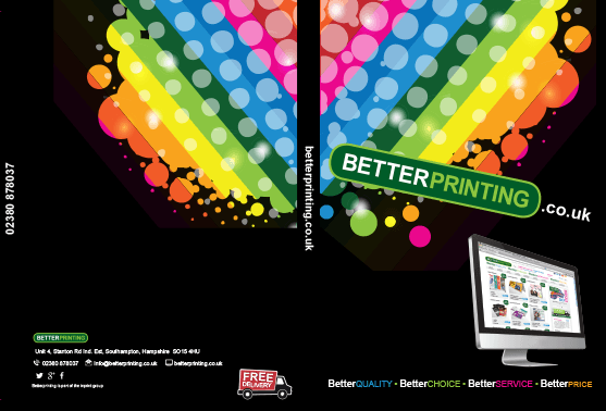
(Example of a full black folder).